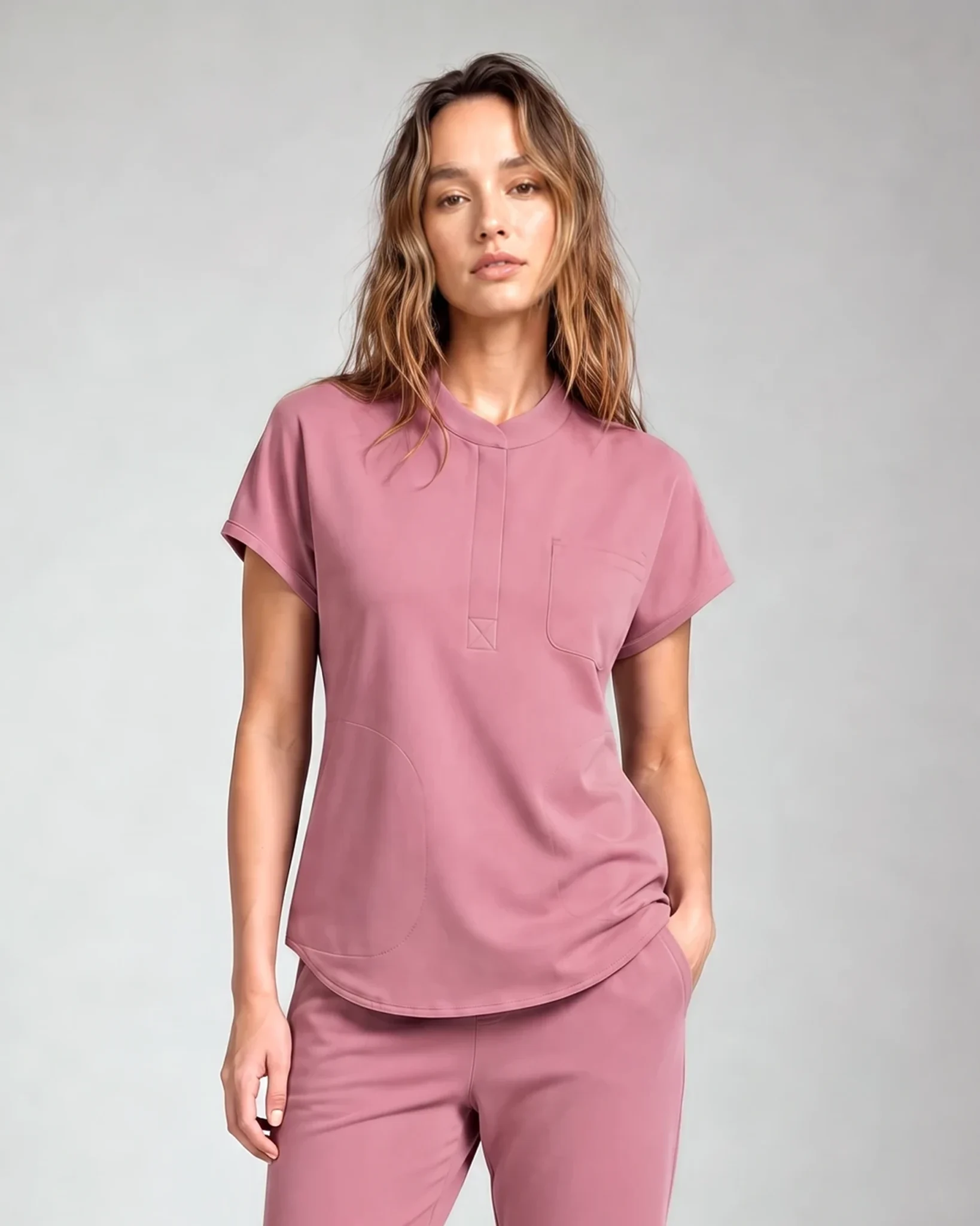

Scrub logo placement should be chosen on the exact garment, not on a blank T-shirt template. Pockets, zippers, collars, wrap lines, seams, and the logo’s proportions determine where the mark can sit without looking crowded or interfering with the garment.
For most clinic uniforms, start with a left-chest option, then compare a sleeve or back-yoke placement only when the logo or role system needs it. Approve the size and position on the selected style before stitching begins.
Start with the garment, logo, and viewing distance
Before choosing a position, put three items side by side:
- the exact scrub top and color;
- the approved logo file;
- the information the viewer must read.
A short practice name and icon may work at a smaller width. A long wordmark, fine line, or stacked credential block may need simplification. The goal is not to reproduce every website detail in thread; it is to keep the important information legible and balanced on the garment.
Also decide who needs to read it. A name used during a conversation has a different viewing distance from a practice mark meant to identify the team across a waiting area.
Left-chest placement: the first option to test
The current LumiScrubs embroidery page lists a left-chest logo at about 3–4 inches wide, vertically positioned between the collarbone area and chest-pocket region.
That range is a starting point, not a command. Check:
- distance from a V-neck or crew neckline;
- whether a chest pocket, zipper, or seam reduces the usable area;
- whether the mark remains level on the worn garment;
- whether a name or credential will sit below or opposite the logo;
- whether the placement works across all sizes in the roster.
A logo that looks centered on a flat top may shift visually when the garment is worn. Ask for the proof on the actual style and color.
Sleeve placement: useful for a secondary identifier
The current LumiScrubs embroidery page lists upper-sleeve marks at about 2–3 inches wide, positioned below the shoulder seam.
A sleeve can work for a smaller practice icon, location identifier, or secondary mark when the chest is reserved for a name and role. It is less suitable when the information must be read directly from the front.
Check whether the sleeve seam, arm movement, and logo shape leave enough space. A wide horizontal logo may need an icon-only version to remain readable.
Back-yoke placement: use only when distance matters
The current LumiScrubs embroidery page lists a back-yoke logo at about 5–6 inches wide. That position is more visible at a distance, but it also creates a stronger uniform statement.
Use it when the practice has a clear reason for rear identification. Do not add a large back mark merely because the space is available. Consider whether the employee also wears a jacket or lab coat that will cover it.
The proof should show the logo relative to the shoulder blades, yoke seam, and garment width in each relevant size.
Place names and credentials as a readable system
Names, roles, and credentials should follow one rule across the team. Decide:
- preferred name or full name;
- capitalization and punctuation;
- credential order;
- whether role text is included;
- whether the text sits below the logo or on the opposite chest;
- how long names will be handled without shrinking the text too far.
Do not infer spelling or credentials from memory. Freeze the roster in writing before approving a personalized run.
The current LumiScrubs embroidery page describes personalized names as typically placed below the chest logo or on the opposite chest. Final positioning still depends on the selected top.
Choose thread contrast on the garment color
A screen preview cannot fully show how thread will read against fabric. Compare the thread under neutral light and from the distance at which the logo or name needs to be read.
Tone-on-tone thread creates a quieter result but can reduce legibility. Higher contrast is easier to read but becomes a stronger visual element. Neither is automatically more professional; the right choice depends on the brand system and the information hierarchy.
When a brand color falls between available thread colors, compare photographed swatches against the chosen garment color rather than approving from a digital color value alone.
Use production-ready artwork
The current LumiScrubs embroidery service prefers AI, EPS, or SVG files. A high-resolution PNG can be reviewed, while screenshots are not treated as production-ready artwork.
Check the source file for:
- thin lines that may disappear in thread;
- tiny text that will not remain readable;
- gradients that need solid-color conversion;
- unnecessary background boxes;
- alternate icon-only or horizontal versions.
Cleaning the artwork before proofing is more predictable than asking the stitch file to preserve details that are too small for the chosen width.
Check the layout across the team’s size range
One proof on one garment size may not represent the whole roster. The logo width can stay constant while the visual spacing around it changes across smaller and larger tops.
Before approval, compare the placement on at least the smallest and largest relevant garment sizes. Pay attention to:
- distance from the neckline and shoulder seam;
- proximity to a pocket, zipper, or princess seam;
- whether the mark appears centered when worn;
- whether long names need a consistent maximum width;
- whether the same placement rule works on men’s and women’s cuts.
If two top constructions place seams differently, they may need separate position specifications even when the logo and thread colors remain the same. Record those specifications rather than relying on a single phrase such as “left chest.”
Include the garment SKU and size range beside each placement rule so the next order does not depend on memory.
Approve the proof in the right sequence
The current LumiScrubs process uses a digital proof, two included revision rounds, and a photograph of a stitched-out sample before the bulk run.
Review the proof in this order:
- Exact garment style, color, and size shown.
- Logo version and spelling.
- Position relative to collar, seams, pockets, and zipper.
- Width and height.
- Thread colors and contrast.
- Names, credentials, and roster accuracy.
- Written approval tied to the final proof version.
Once stitching begins, personalized LumiScrubs garments are final sale unless defective. Fit, color, roster, and artwork decisions therefore belong before approval, not after production.
For service pricing and the full proof workflow, use Embroidery on Scrubs: Cost, Placement, and Proofs. When the garment choice is settled, review the current LumiScrubs embroidery service.
Frequently asked questions
Where should a clinic logo go on scrubs?
Left chest is the first position to test, but the exact choice depends on the collar, pockets, zipper, seams, logo shape, and required viewing distance.
How large should a scrub logo be?
Use the service’s placement range as a starting point, then approve the scale on the exact garment. Long wordmarks and detailed marks may need a different version rather than a larger size.
Can a logo go above a chest pocket?
Sometimes. Confirm the available height, seam clearance, and visual alignment on the selected top before approval.
Should names and credentials be on the same side as the logo?
They can sit below the logo or on the opposite chest. Use one written team rule and check the longest name before freezing the layout.