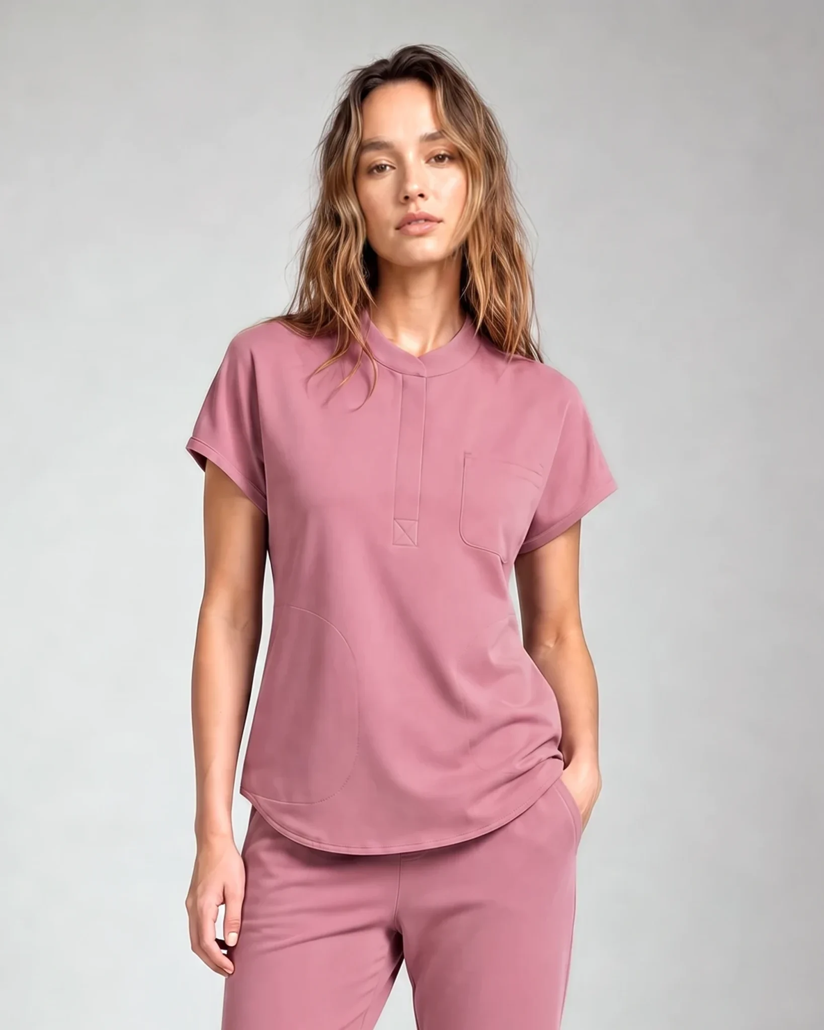

Ceil blue is a light, cool blue—softer and grayer than royal blue, and much lighter than navy. The catch is that “ceil blue” is a commercial color name, not one universal digital color code. Two scrub brands can use the same name and still produce visibly different shades.
If your employer specifies ceil blue, compare the actual garment or the brand approved by your workplace. Do not rely on a screen image or a color name alone.
What does ceil blue look like?
Picture a light blue with a restrained, slightly gray cast rather than a bright, saturated blue. That description helps separate ceil blue from nearby names, but it cannot identify an exact garment. Fabric texture, dye, camera settings, editing, room light, and the screen used to view a photo all influence what you see.
When a product page labels a garment “ceil blue,” use the label as a starting point. Then look for several kinds of evidence:
- a full-garment photo on a neutral background;
- a closer fabric photo that shows texture;
- the same color photographed from more than one angle;
- a live color selector connected to the exact product;
- workplace guidance naming an approved brand or example garment.
If a dress code lists only the words “ceil blue,” ask whether similar light blues are accepted or whether the office expects a particular source. That question is more reliable than trying to match a screenshot by eye.
How is ceil blue different from navy and hunter green?
The three colors are easy to separate at a broad level, even though exact shades vary.
Ceil blue
Ceil blue belongs to the light-blue range. It reflects more light in a photograph and usually creates less contrast with white than navy or hunter green. Depending on the fabric and lighting, it may look cooler, grayer, or closer to a soft sky blue.
Navy
Navy belongs to the dark-blue range. In bright light, the blue character is easier to see. In dim or warm light, a very dark navy may look close to black. Compare navy next to black if the distinction matters to your workplace.
Hunter green
Hunter green belongs to the deep-green range. Some versions lean cooler and others look more muted. In a dark room or a compressed online image, deep green can lose visible color detail, so use a well-lit photo when comparing it with navy.
These descriptions are useful for orientation, not approval. A workplace rule always takes priority over a general color guide.
Why can the same color look different online?
Online product color is an interpretation of the garment, not the garment itself. The product passes through a camera, image processing, website compression, and your display before you see it.
Your phone may also change brightness or color temperature automatically. A warm display setting can make a cool blue look duller, while a highly saturated display can make a muted shade look brighter than the fabric. The background of the photo matters too: a light blue can look darker against white and lighter against a deep background.
Use online images to compare broad families and garment details. Do not use a screenshot as an exact color standard unless your employer has approved that specific product.
How should you compare scrub colors before ordering?
Start with the workplace requirement, then compare products in a repeatable way.
Confirm the wording
Write down the exact color name in the dress code. “Blue” is not the same instruction as “ceil blue,” and “dark blue” may not mean the same thing as a named navy product. If the policy includes a vendor, product code, or example photo, keep that information with you while shopping.
Nursing students can use the Clinical Attire Policy Index to see how official policies handle exact colors, vendors, logos, shoes, and site-specific rules. It does not replace the policy for your own program or site.
Compare the exact product, not a brand-wide swatch
A brand may use similar names across several fabric groups or product lines. Open the live selector for the exact top or pant you plan to buy. Check that the product page, selected swatch, image, and cart label all show the same choice.
Match top and pant deliberately
If your workplace expects a matching set, select the top and pant from the same documented color option whenever possible. Do not assume that two products called “navy” or “ceil blue” will automatically match when they come from different brands or unrelated product lines.
Review the garment under more than one ordinary light
Keep the tags attached and view the garment near indirect daylight and under the indoor light where you normally get dressed. You are not trying to conduct a laboratory color test. You are checking whether the garment remains clearly within the color family your workplace expects.
Compare with an approved reference
If you already own an accepted uniform, place the new item beside it. If a manager needs to approve the shade, ask before laundering, altering, or embroidering the garment.
Which color should you choose?
Choose the color required by your employer. When you are allowed to choose, make the decision from your own wardrobe and work needs rather than from universal claims about what a color supposedly communicates.
Consider these practical questions:
- Which colors are already in your uniform rotation?
- Do you need the top and pant to match exactly?
- Is your preferred shade available in the exact garment and size you need?
- Will you wear an approved underscrub or jacket with it?
- Can you confirm the shade before personalization?
Color preference is personal, and workplace color systems are not universal. A color used for one role in one facility may be used differently elsewhere.
What should you avoid when buying a named scrub color?
Avoid choosing from the swatch alone. Small digital circles often simplify the color and do not show how it behaves across a full garment.
Avoid mixing a top and pant merely because both names sound similar. “Sky,” “ceil,” “powder,” and “light blue” can overlap visually without being interchangeable.
Avoid assuming that an older blog photo proves current availability. Product selectors change, so the live product page should be the source for what can be purchased now.
Avoid laundering or adding embroidery before you have checked the shade and fit. Personalization can change what options remain if the garment is not right.
Compare current LumiScrubs colors
The sets these colors are on right now
Ceil blue, navy, dark harbor and royal blue all sit on the men’s Motion set; navy, hunter green and burgundy sit on the women’s Core set. Open a product page and use its color dots — the photo on that page is the specific colorway, not a brand-wide swatch.
 Motion Scrub Set Men's$64.90
 Core Scrub Set Women's$64.90
 Core Scrub Set Men's$64.90
 Motion Scrub Set Women's$64.90
After confirming your workplace rules, use the LumiScrubs Shop to compare current product photos and live selectors. Check the selected color again in the cart before completing an order. The selector on the exact product page is more useful than a color mentioned in an older article.
Frequently asked questions
What color is ceil blue?
Ceil blue is generally a light, cool, muted blue. It is much lighter than navy, but the exact shade varies by product and manufacturer.
Is ceil blue the same as sky blue?
The names may describe nearby light-blue shades, but a color name does not establish an exact match between garments. Use the exact garment or an employer-approved reference when color accuracy matters.
Is ceil blue lighter than navy?
Yes. Ceil blue is in the light-blue range, while navy is a dark blue.
Is hunter green close to navy?
Both can appear dark, but hunter green is a green and navy is a blue. Good lighting makes the difference easier to see.
Can I mix a ceil blue top with navy scrub pants?
Only if your workplace allows mixed colors and you like the combination. If a matching uniform is required, confirm both pieces against the approved color guidance.
Why does ceil blue look gray in some photos?
A muted dye, fabric texture, camera processing, background, room light, or display setting can make a light blue appear grayer. A single online photo cannot establish an exact shade.